Why Artists Should Study Data Visualization
In the art world, the word “data” often arrives with an air of corporate detachment, as if it belongs in analytic dashboards rather than studios. Yet data visualization is not an adversary to creativity. It is one of the most generative visual languages available to artists today, an unexpected meeting point between aesthetic intuition and structural clarity.
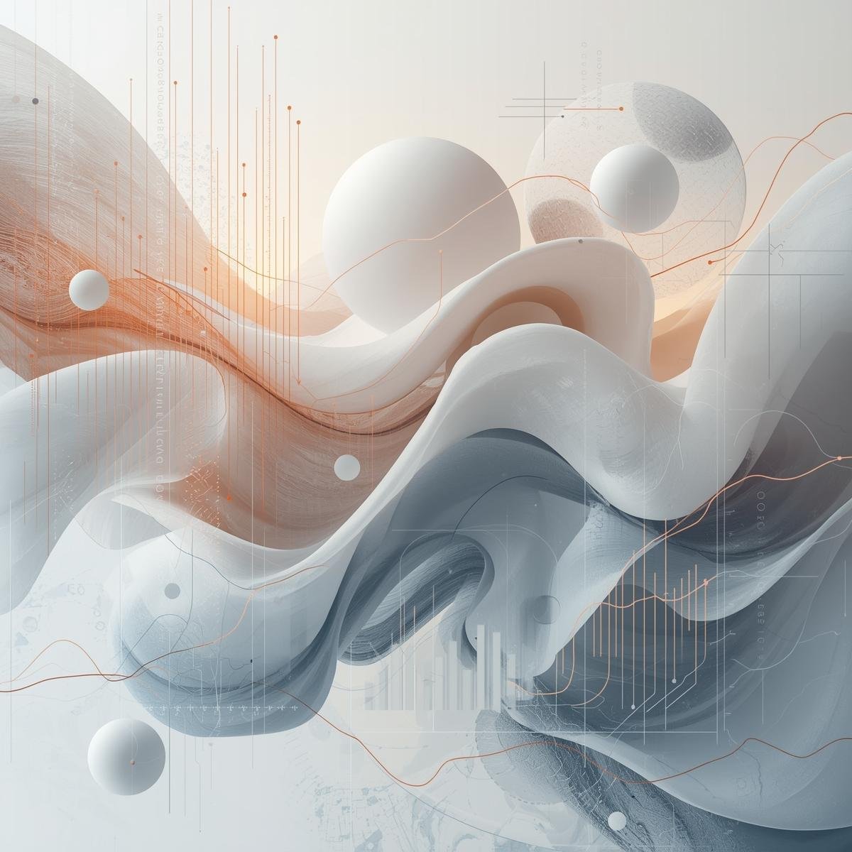
Artists do not study data to become analysts. We study it because numbers conceal the very patterns we try to paint: color frequencies, emotional cycles, collective behaviors, digital mood shifts. These phenomena exist beneath the surface of culture, and visualization simply renders them perceptible. Once an artist engages with data, it stops functioning as information and begins to behave like material. A chart becomes a composition. A dataset becomes surface. A cluster map becomes a landscape. An algorithm becomes rhythm.
My own understanding of this began years ago while working on a painting that refused to resolve itself. I kept returning to a specific gradient, sensing it held something I could not articulate. Later, after running a palette-analysis model on my past work, I realized the gradient mirrored a recurring emotional motif across dozens of pieces. Data revealed what intuition had been whispering. That revelation, quiet but transformative, reshaped how I approached color from that moment onward.
This relationship between visual art and informational structure is not new. Artists within the early Information Aesthetics movement, such as Hans Haacke, recognized that systems carry their own visual and political languages. What feels new today is the scale and fluency with which contemporary creators can access this material. In works by Refik Anadol, Sougwen Chung, and Quayola, data does not merely inform form; it becomes form. Their practice exemplifies a paradigm in which artists think computationally and visually at the same time, collapsing the boundaries between sensory experience and digital logic.
Today, cultural institutions and industries operate through visualized data. Luxury fashion houses use chromatic forecasting to sculpt seasonal palettes; museums analyze audience patterns to design spatial narratives; creative studios track visual resonances across global media ecosystems. At the 2024 Venice Biennale, several installations employed data-driven visual systems to expose ecological and social tensions. Similarly, Serpentine’s recent “Future Art Ecosystems” programming foregrounded computational imaging as a central aesthetic force. These moments signal a shift: trends are no longer guided by intuition alone. They emerge from vast datasets that still require precise aesthetic interpretation.
This is precisely where artists matter. We understand rhythm, tone, emotional resonance, compositional balance—the elements machines can simulate but cannot feel. Working with data does not dilute our humanity; it reveals its architecture. Visualization teaches us how softness curves, how longing clusters, how memory dissolves into gradients. It sharpens intuition rather than undermining it.
Ultimately, data is not a threat to creativity. It is a mirror. It reflects our patterns of desire, our fears, our shifting cultural memory. And when artists hold that mirror, the reflection becomes something else entirely: an emotion rendered visible, a feeling translated into form.